Accessibility eLearning platform
role
UX Design Researcher & Team Lead
timeframe
12+ weeks
description
WHEEL-LEARN aims to increase access to healthy lifestyle behaviors for people with spinal cord injury (SCI) through an eLearning website.
I collaborated with another designer and physical therapist to create a web interface with additional accessibility considerations for people with SCI.
highlights
trending_up
Increased user comprehension of design components by 30%.
sentiment_satisfied
Achieved excellent perceived usability, measured by a System Usability Scale (SUS) score of 85.
context
Focusing on a population in need
Up to 70% of people with SCI experience shoulder pain, impacting mobility and overall quality of life. WHEEL-LEARN was developed to teach people with SCI how to live a healthier lifestyle, despite their disability, to support an independent lifestyle.
How do we design an engaging program to get people with SCI to adopt healthy lifestyle behaviors?
The WHEEL-LEARN PDFs
Previously, WHEEL-LEARN was a series of PDFs and online Zoom sessions delivered by a physical therapist. She asked us to develop the existing curriculum into an interactive web-based experience.

our goal
Turn PDF content into an accessible eLearning website that increases interactivity.
research
Learning from lived experiences
Our team acknowledged our lack of experience with the lived experience of having a SCI. We did a literature review to explore digital accessibility, behavior interventions, and engagement strategies for people with disabilities. Additionally, we attended Tech Talks by United Spinal to understand how individuals with SCI interact with technology.
We found that:
block
People with SCI face major barriers when trying to get active.
ads_click
People with SCI have difficulty with range of motion and connecting with digital targets.
wheelchair_pickup
People with SCI have a wide range of challenges depending on their injury.
defining site architecture
From static PDFs to interactive learning
The previous WHEEL-LEARN PDFs were 40+ pages with 5 lessons. To make the program more interactive, large PDFs needed broken into smaller chunks. The previous content needed to be organized in a suitable website format.
To do this, we went through a brainstorming exercise to get some ideas on how the physical therapist imagined the site in action. From there, I developed the site architecture to segment the previous content into pieces that could be implemented in a website.

Guiding the design with purpose:
psychology
How might we display social cognitive theory in a digital interface?
arrow_range
How might we use affordance to accommodate a population that has differing levels of needs and ranges of mobility?
web_traffic
How might we convey the clickable range of a target while still maximizing our space?
communities
How might we serve this community by encouraging them to live a healthy lifestyle without losing motivation when faced with chronic pain?
wireframing
Challenging familiarity and accessibility in wireframing
There were so many possibilities for how to layout the screens. I wanted to follow eLearning site patterns for familiarity, but our target users had completely different needs for digital sites. Trying to maintain eLearning design patterns while creating an interface that acknowledged different accessibility needs was difficult at first.
Guiding wireframes with 2 main principles:
arrow_selector_tool
Avoiding scrolling or swiping motions would reduce user fatigue.
decimal_increase
Targets for taps or clicks needed to be at least 100px tall or wide.
Getting feedback from the project lead
We walked through the flow of our wireframes with the physical therapist to ask initial questions about the physical accessibility of our design.
Unit Page
3p
"Side to side motions might cause less fatigue than up and down motions."
I implemented this in our design and switched a vertical carousel to a horizontal one.


Unit Cards
3p
"Showing the timing of a lesson might be discouraging and overwhelming for some users."
We removed the timing and replaced the Lessons with only the Unit topics to reduce cognitive load.
Unit Page
3p
"A visual progress bar would help users see how close they are to a goal."
We chose a version with a progress bar that reduced scrolling. We'll continue refining this design in the next iterations.

informal user testing
Testing visual design choices with users
As we started to add colors and typography of the WHEEL-LEARN brand, it became difficult to decipher what would be important to users. In order to decide user's preferences, we decided to do some informal usability testing.
We took our wireframes and made mockup images of our interface. We showed these to 3 users, and walked them through the flow of the screens. We asked them questions to test comprehension of the interface components and their preferences in the interface.
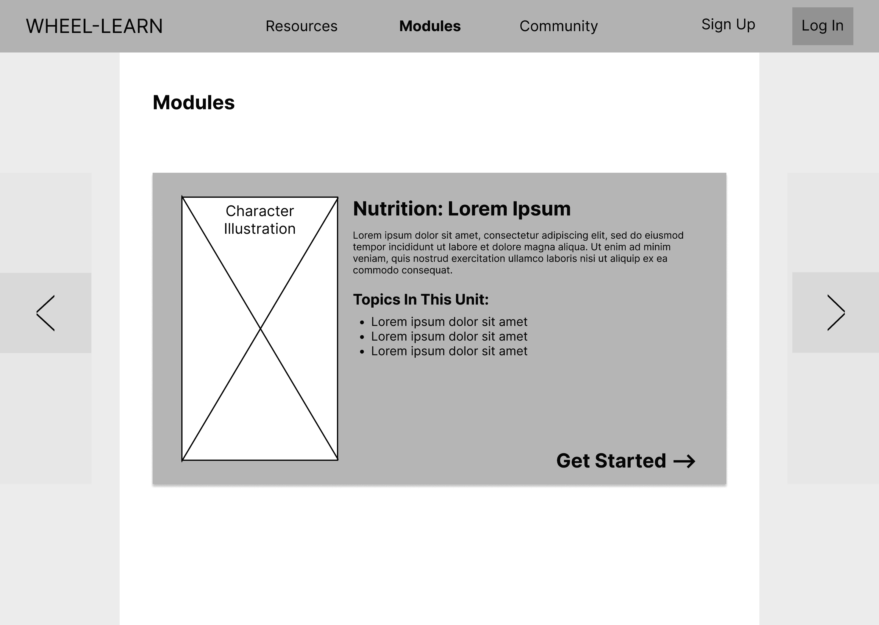
Module Page
preview
Seeing a sneak peek of the content on the sides let users know where they were going.
All users preferred the this version of the Unit page and navigation arrows.

Dashboard
flag
It is important to keep in mind what they are trying to accomplish.
All three users liked the version of the dashboard with the colored SMART Goal at the top. The SMART Goal was most important to users, and the color made it stand out more.

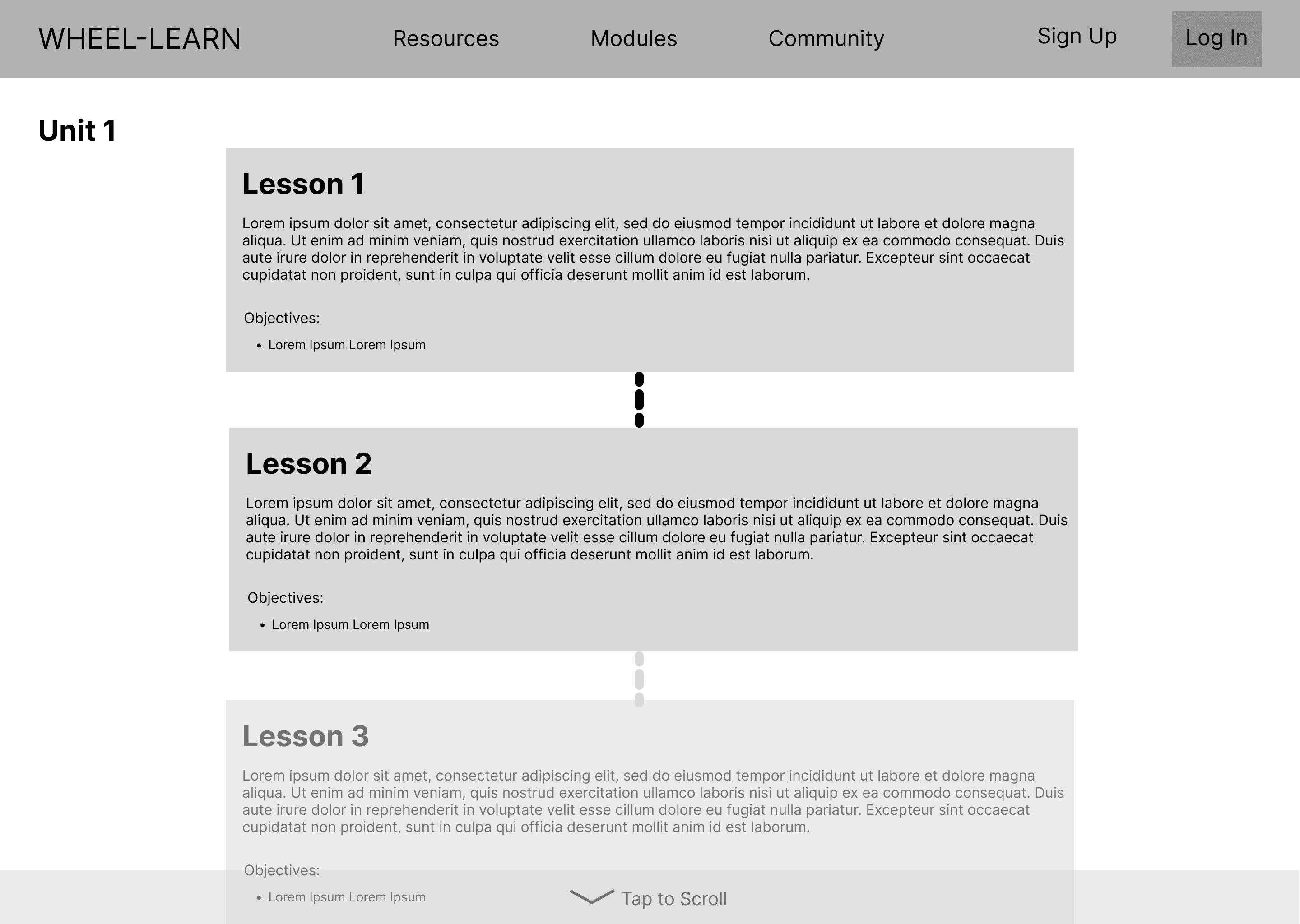
Lesson Pages
flowchart
All users comprehended the meaning of the winning progress bar.
Most users preferred this version of the Lesson page and progress bar. In the losing design, 2/3 users expressed confusion with the various wording on the page and the meaning of unit progress.

Inside the Lessons
find_in_page
Users were able to identify navigation through various options.
Users preferred this version of the lesson inner design and were able to identify additional navigation in the top bar. Users needed multiple options for navigating the page, due to the research we had done in the beginning.

final designs
Finalizing an interactive prototype
We took these insights, and I created an interactive prototype iteration for the WHEEL-LEARN website that could be tested with real users.
conclusion
Bringing the next iteration to life
We then tested this prototype with 5 users, some of whom were people with SCI and some who were healthcare providers. We wanted feedback not only with our target users, but with the professional perspective of healthcare providers that would work with our users to create a healthier lifestyle.
We took their feedback and completed affinity diagramming and sentiment analysis to draw out the important insights and improvements for the website implementation.
Content understanding vs. design accessibility
online_prediction
insight
Divided content lead users to be confused about navigation.
new_releases
improvement
Restructure to focus on natural content progression.
Originally, we thought that these smaller segmented Sections in the Lessons would reduce scrolling and make the design more accessible. However, the Sections actually confused users about how sections related to one another. This led to confusion in navigating to different parts of the Lessons when a sequential flow was interrupted.
I lead a brainstorming session with our physical therapy project lead to uncover how we could restructure the content before working on the web implementation.

Intentionality of the Skills feature
online_prediction
insight
Uncertainty about a feature causes users to not interact.
new_releases
improvement
Iterating on Dashboard Skills will clarify their purpose.
Initially we thought that the Skills would allow users to identify what traits they might already have that would help them improve in the program. They would be able to grow in these Skills throughout the WHEEL-LEARN program.
While users felt that while it was important to remember Skill traits they currently posess, they were unsure of how the specifc Skills feature related to the WHEEL-LEARN program.
After testing, we realized that the Skills feature may not have been as intentional as we would've liked. We decided to further ideate on how to properly capture the reflective nature of the Skills, and that will help users interact with the program on a deeper level.

Users can't navigate without context
online_prediction
insight
A landing page acts as a guide for users to start their journey.
new_releases
improvement
Develop the landing page as the starting destination.
Due to the nature of testing a small section of what would be a larger website, many users felt they were thrown in the middle of the program. Participants often felt unsure of what a Unit or Lesson was, or what "progress" represented due to the testing environment that held little prior context.
We began to create mockups of a landing page, focusing on the page as a starting destination for users on the WHEEL-LEARN journey.

Developing a meaningful community
online_prediction
insight
Community support is crucial for program success.
new_releases
improvement
Organically build a community through program interaction.
Users were asked open ended questions about what content they envisioned in the community page. Many stated that community support was essential to their completion of the program and would like to hear more from their peers.
When developing the community page, we should consider ways for participants to discuss with their peers and expand their learning with the help of others. For now, I suggested the easiest way to foster community was to implement a Discord server, where learners would be able to engage with one another in a casual chat format.

our next goal
Implement these improvements into a functional WordPress website.
I won’t go into detail on the development process in this case study, but feel free to get in contact if you’re interested!
retrospective
Inclusive design with real users
Overall this project really stretched my ability in terms of designing for accessibility. Following only WCAG is one thing, but implementing additional design considerations for specific populations can be difficult.
What I learned
checklist
Designing features with intentionality
Hearing the feedback on the Skills feature had me rethinking the feature choice entirely. The confusion and user feedback we got on this feature will definitely make me consider the purpose of everything I design in the future.
production_quantity_limits
Limited resources
Over time, I would love to see this project evolve with smartwatch tracking abilities, daily activities recording, and more. Unfortunately, in this current stage, a lot of what we could designed was limited by what we as a small student team could implement. This project definitely stretched our project resources thinly.
accessibility_new
Accessibility beyond WCAG
This project made me a bigger advocate for accessibility. I learned a lot about WCAG during this project, but we also unexpectedly explored accessibility design systems. I would love to work on more accessibility-focused design systems, taking in other considerations like target accuracy and navigation.
up next
how about another story?

Explainable AI Tools for Smarter Data Collection
arrow_right_alt